
THE CHALLENGE
Cotopaxi is an outdoor gear retailer that is trying to give back to the world with every sale they make. They noticed that customers were dropping off their website and they weren't seeing as much engagement as they wanted. They gave us the task of looking at their home and product pages to discover a way to help user engagement, get their message out, and increase online sales.
On this project we worked as a team of four. I was paired with Leigh Baumgartner to work on the product page and customer conversion. Tyson Gustafson and Michal Chaplin were our other team members who worked on the home page and branding.
MY CONTRIBUTIONS
- Content Inventory of Product Page
- Documentation
- Organizing Files
- Card Sorting
- Writing Surveys
- Writing Usability Test Scripts
- Conducting Usability Testing
- SWOT Analysis
- User Story Mapping
- 10X10 Sketches
- Wireframes
- High Fidelity Mock-ups
- Prototypes
- Prototype Testing
DISCOVERY
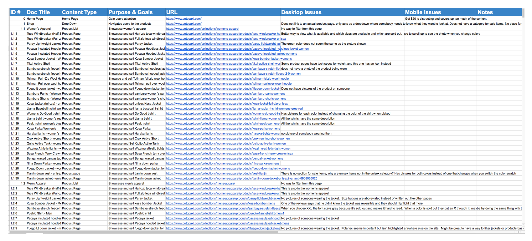
Research was started by doing a content inventory of the site. By doing this I discovered a lot of irregularities and opportunities to create a better experience for shoppers. The most prevalent irregularity was that every navigation item took the user to it's own landing page except the Shop menu. I wanted to find out more and decided to add it in to look at it more through usability testing.
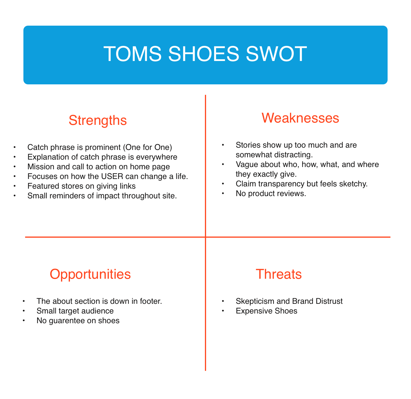
The next approach was to do a SWOT analysis of what other social entrepreneurships were doing. I decided to look at Toms Shoes and then presented my research to the group. I focused a lot on the companies branding and how they presented their mission. I noticed that Toms Shoes had some well written copy when it came to promoting their mission. They had a great call to action on their home page that focused more on how the user was making a change by buying their products instead of what they as a company were doing to make a change.
In order to get some initial information and to help us find our direction we chose to send out a survey to see what people thought about clothing and ethical companies. We wanted to learn about their trust in companies that say they are ethical and what ethical issues they cared most about.
Fro the survey we learned that the top issue people cared most about was human rights (Child labor, Cheap labor), which is Cotopaxi's main mission. Thirty-three percent of people said that they were skeptical of retailers ethical claims which meant we were going to need to gain the user's trust while presented their brand and mission throughout their site.
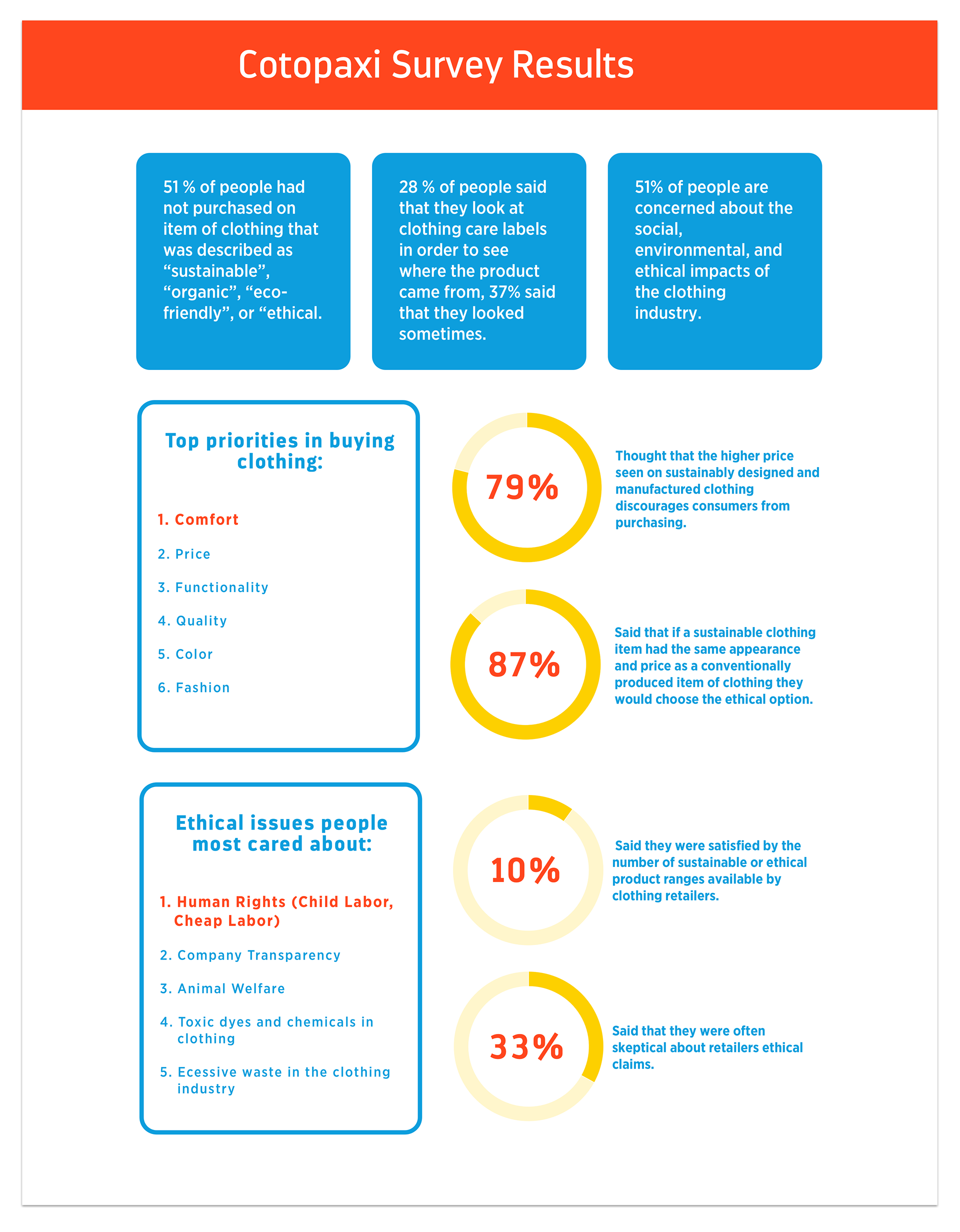
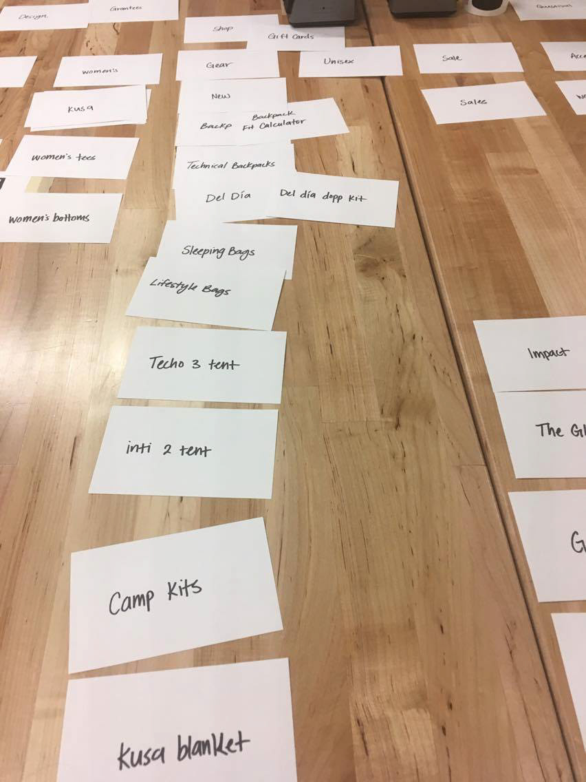
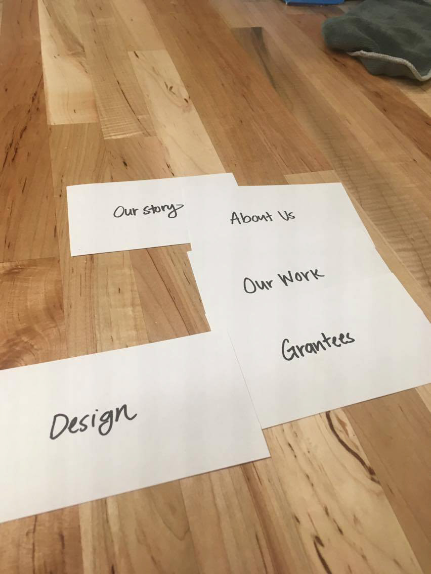
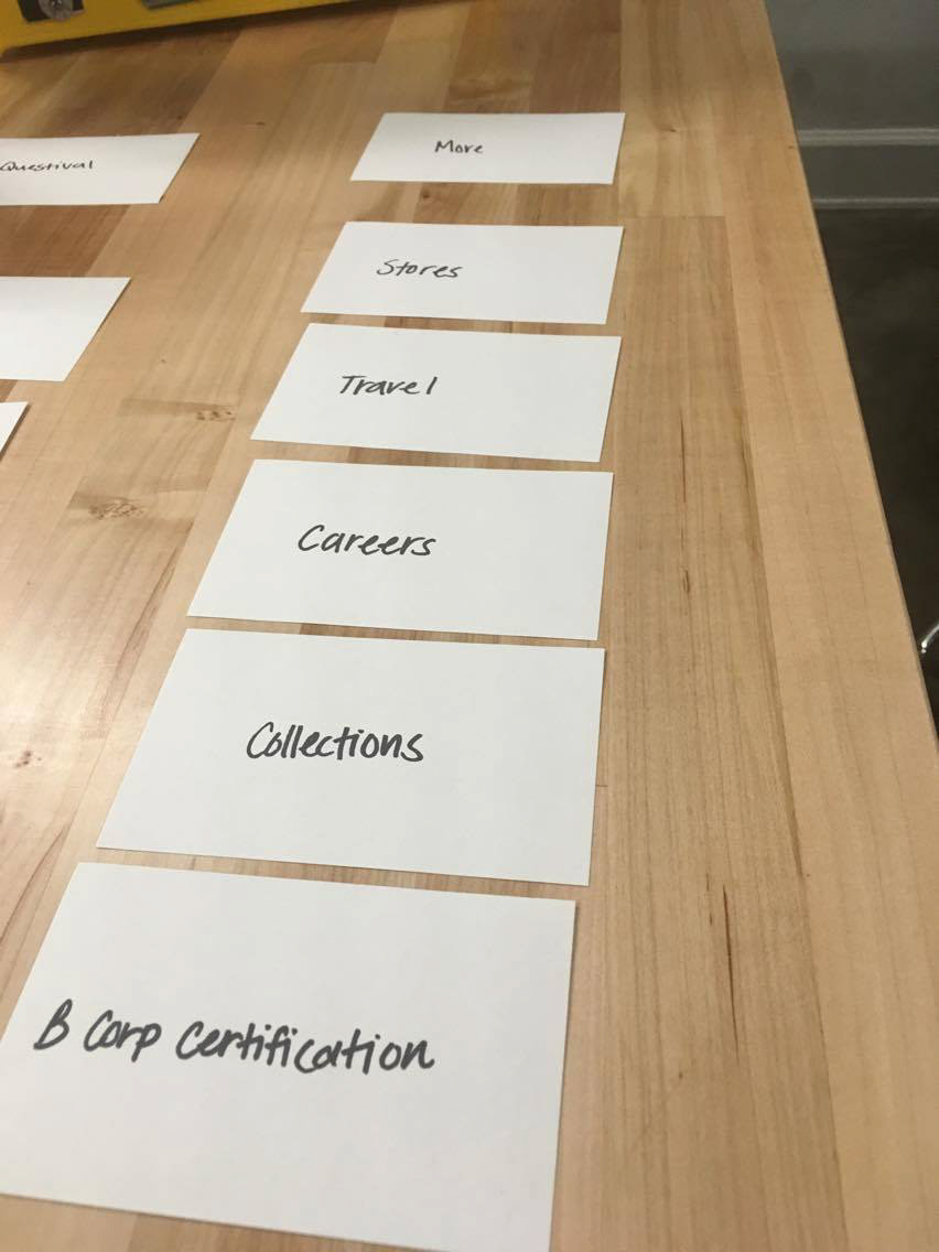
Once we knew more about the company and what other similar companies were doing we moved on to user testing. I started with some closed card sorts. I put out Cotopaxi's navigation bar categories and then gave the users cards for the rest of the information to see how they would group them together. I found there were quite a few items that people consistently put into other categories, and most people could not decide where to put the Unisex options and Indiegogo links. A lot of them gave up and said they had no idea where they could possibly fit with the options given to them. From this we learned that the unisex items of clothing were confusing to users and that people did not understand what they were unless they were told.
After the card sorts Mikey and I wrote a usability script to test Cotopaxi's current website. Here is a video of one of the usability tests that I conducted:
Usability Test Video
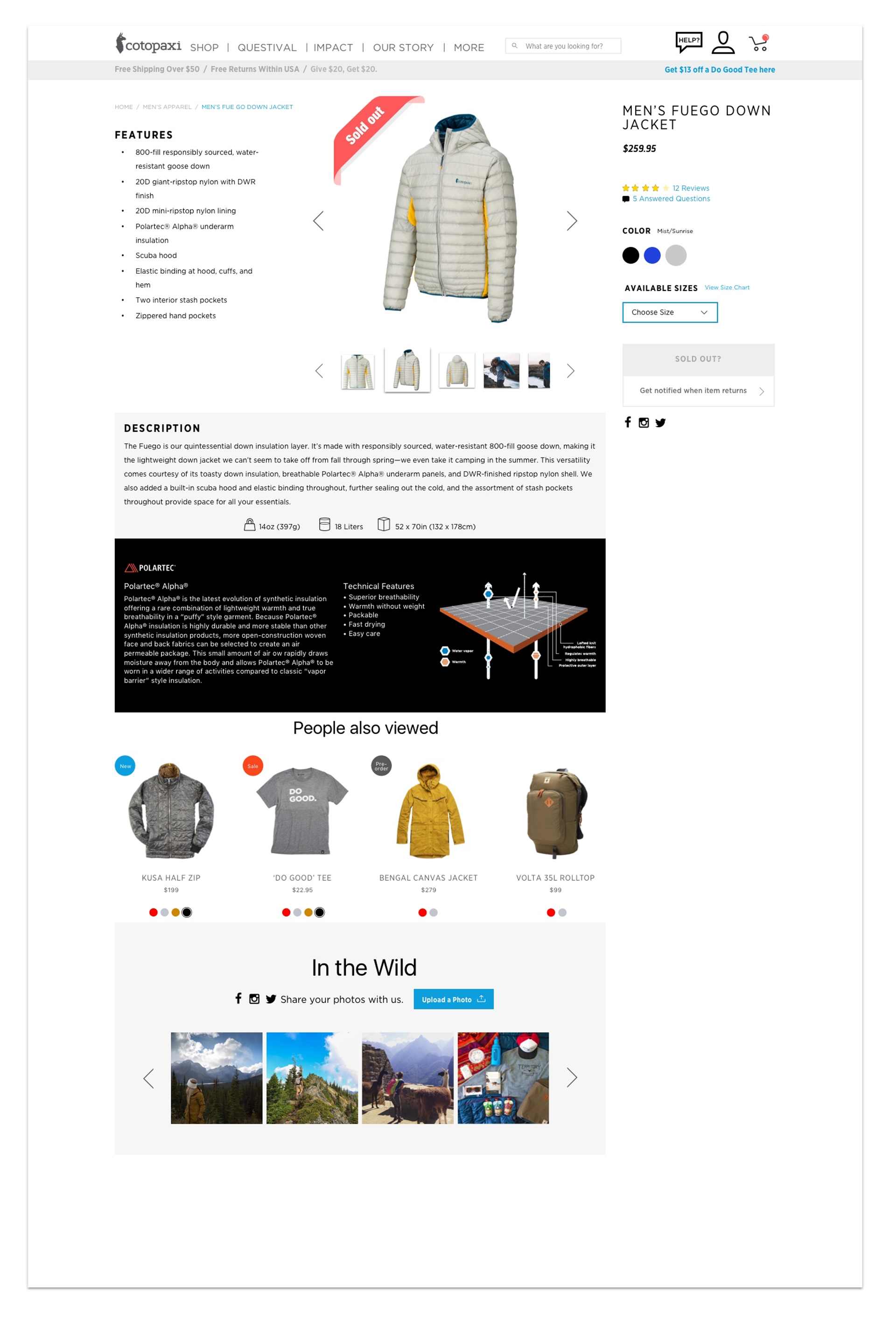
From the research I saw where a lot of the friction points were for the users. Many of them tried to click on the Shop menu item and when it didn't work were forced to use a drop down menu to find what they were looking for. There was a lot of confusion about items being sold out and choosing the right size and color before checkout. One of the major problems was with one of their unique products called the Del Dia Backpack. Customers are not able to choose the color of the backpack because they use recycled fabrics and the workers choose what colors to sew together which makes every one different. Every person I did a usability test with chose a picture with the color they liked and were confident that was the color they would be receiving once they added it to their cart.
EXPLORING THE PRODUCT PAGE
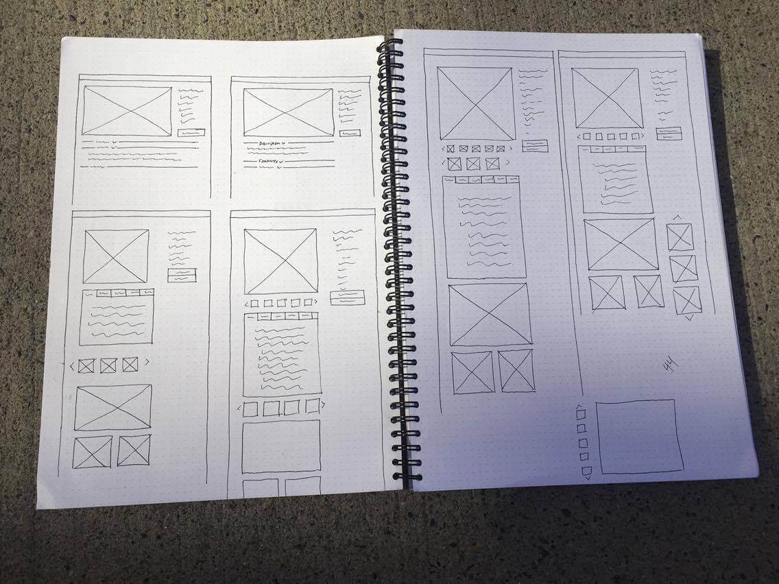
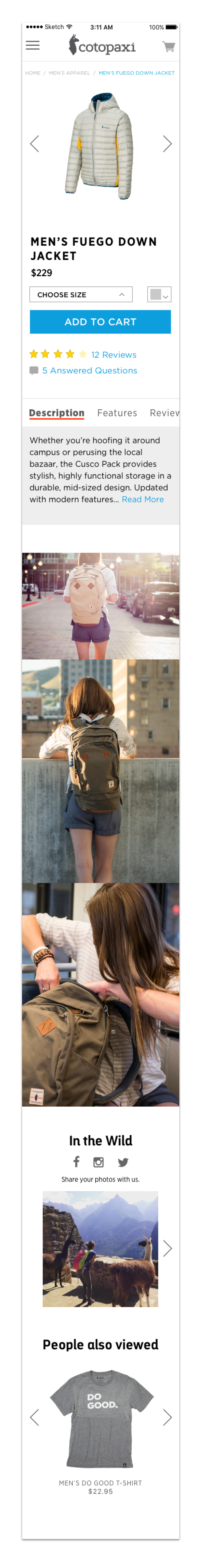
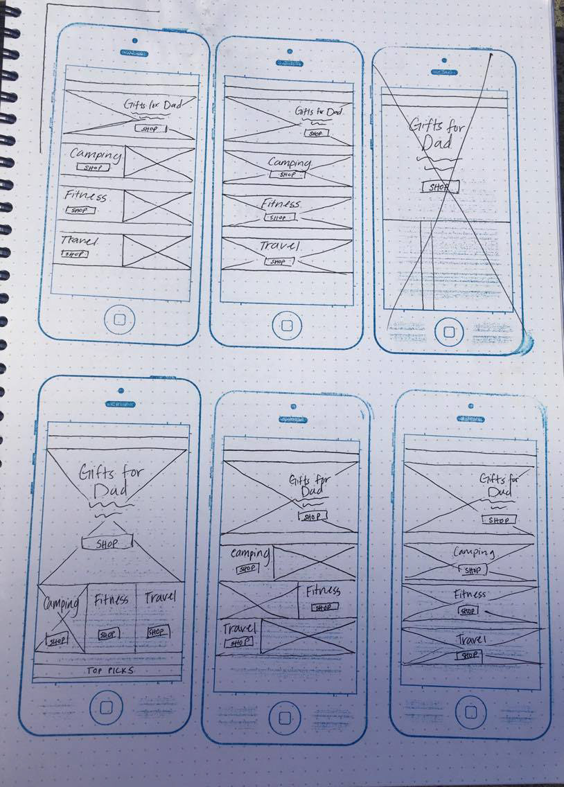
After the research was done we decided, as a team, to first work on the product page and fix some of the inconsistency issues. The goal was to make their information easier for customers to see and understand. I started by doing 10X10 sketches of the purchasing information:
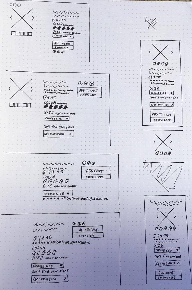
My 10X10's consisted of different ideations of the order we could put the purchasing information in. I tried putting the "Add to Cart" button to the side by itself, but ultimately ended up including it with the rest of the information because we decided to go with a cart that stayed static. Cotopaxi originally had individual buttons of each size which cluttered the page. I cleaned it up by using a drop down size picker.
The image on the bottom left is the first ideation. After design reviews and speaking with the client we decided it was too "Amazon" and although it did solve the problem of user's having to scroll to see the information it was not the look they wanted and we decided to go with something more clean looking. I did some more 10x10 sketches and the second ideation was designed. The client told us that they would like some large lifestyle images added to the product page and showed us taylorstitch.com as a reference. I was worried about product information being too hard for user's to reach underneath large photos so we sketched out ideas for a drop down and tabbed system. The image on the right is our ideation of drop downs.
The tabbed design was shown during a design review and some great feedback was given about trying to use tabs instead of the drop downs. We decided to explore this idea.
The only problem I ran into with a tabbed system was how to implement it on mobile . There were too many tabs to fit across a mobile screen and still keep them legible. I did some research on tabs and decided to test my ideas. I took my two best, prototyped them, and then tested them on users.
The first prototype is using a vertical scroll on the tabs. The last word is cut off letting the user know that there is more information they can scroll to:
Prototype Video
The second prototype uses buttons instead of tabs. I knew that this would take slightly more work on the development side but thought it would be much easier for the user to find what they were looking for.
Prototype Video
I tested the designs on 7 people and those that fit into our demographic had no problems finding the Questions tab in the vertical scroll prototype and visually preferred it over the buttons.
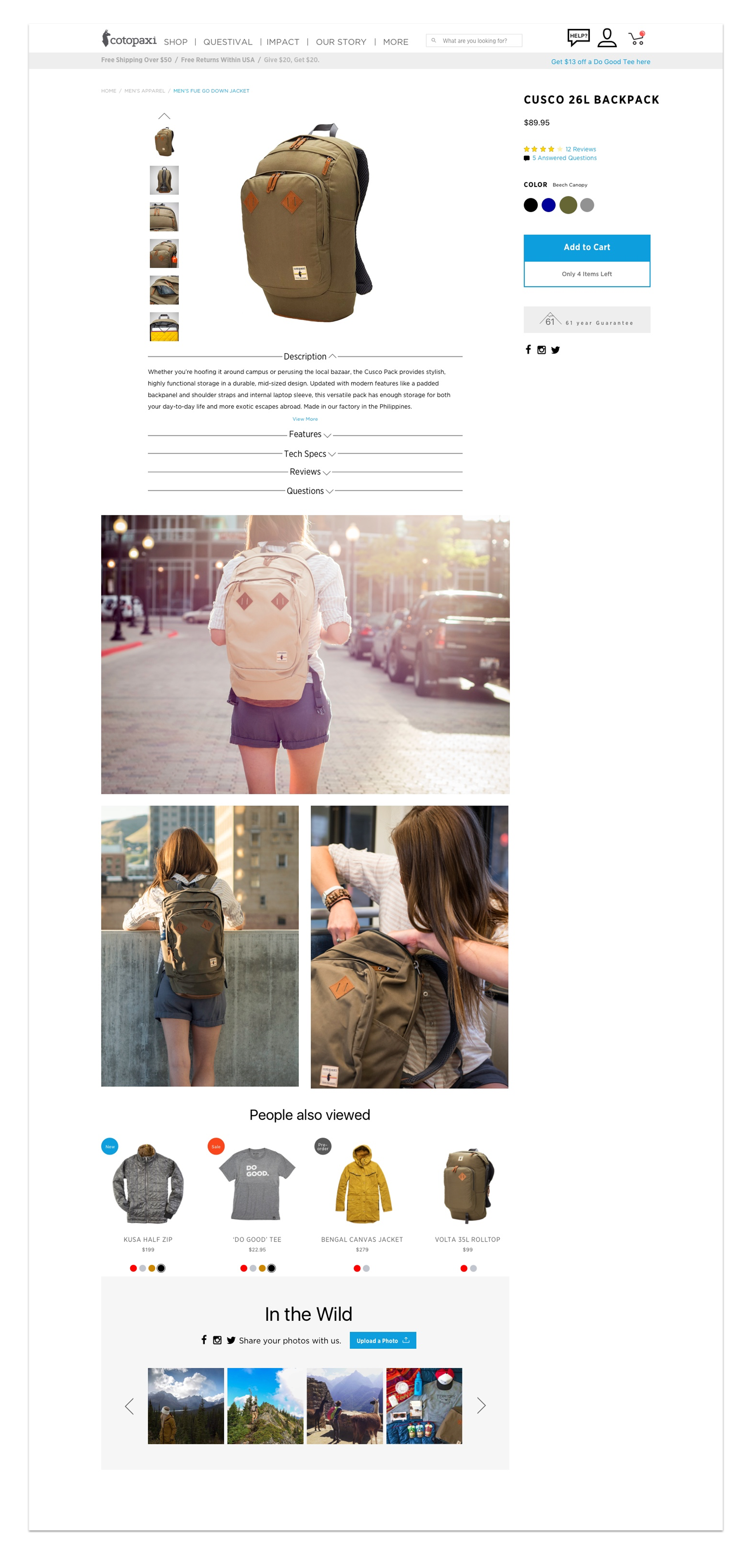
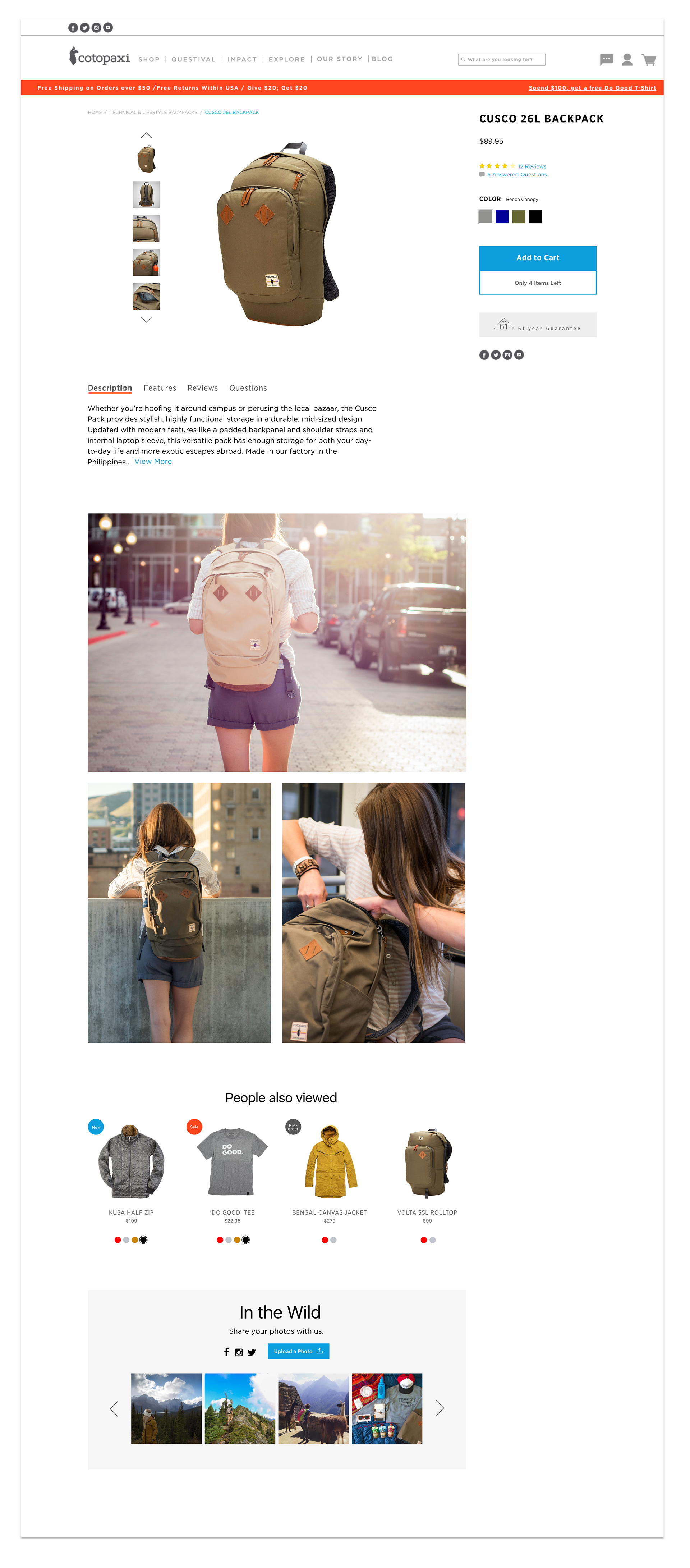
PRODUCT PAGE DELIVERABLES
After our research and testing the end deliverable was a product page with tabbed information with vertical scroll tabs on the mobile version. We also implemented a static cart for the desktop version that is shown in the video below.
High fidelity product page prototype shows the use of a static cart and a tabbed system for finding product information.
EXPLORING THE SHOP PAGE
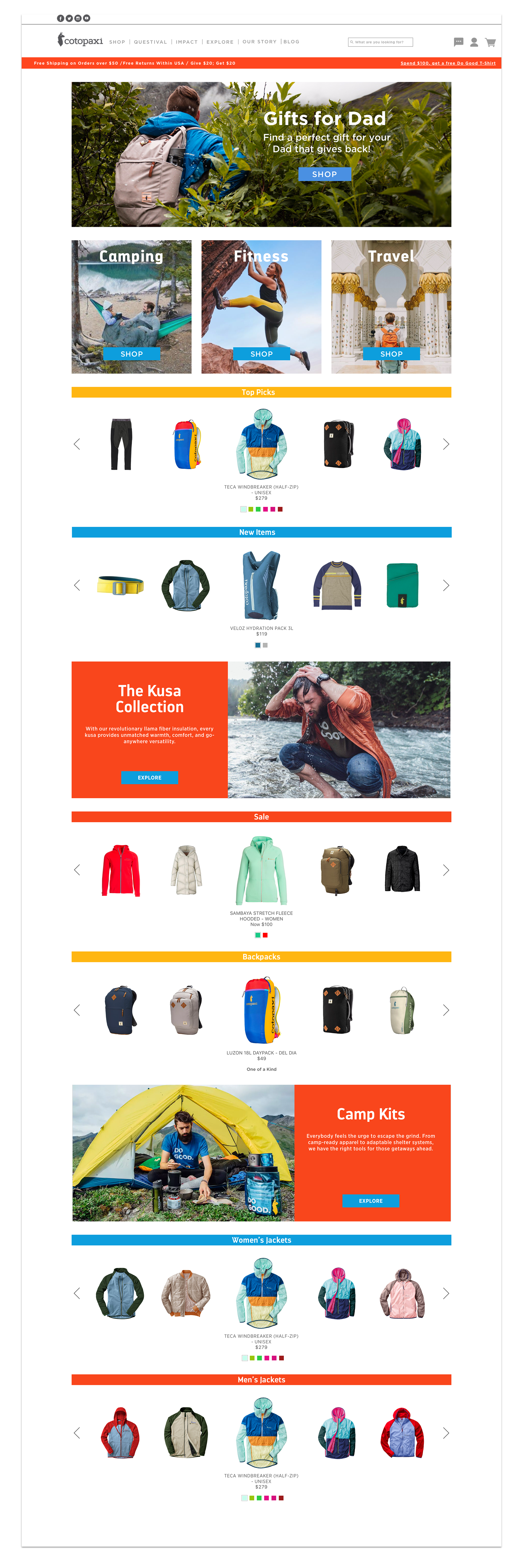
During the process of designing and testing the product page we had also started on the shop page. I looked at other similar businesses across the web to gain some insight into what other companies were doing. I wanted the page to be easily browsable for customers who weren't sure exactly what they wanted to purchase. In my first sketches I ideated a lot on where and how to show the product on the page. Here are some 10x10 sketches for web and mobile and my first wireframe.
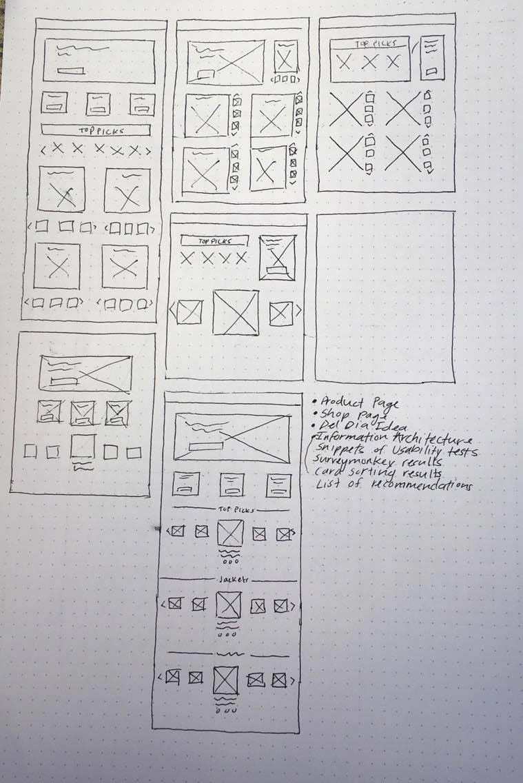
This is the first ideation. It has a promotional banner at the top and activity categories for products. After that it had carousels with browsable products, the first being Cotopaxi's top picks.
After a design review and collaboration with our other teammates it was decided that more color and variation was needed to break up all of the browsable content.
This page was also shown to several users who were confused about the color swatches that were circles. Many of them thought they looked like page indicators and it took them quite some time to realize what they actually were.
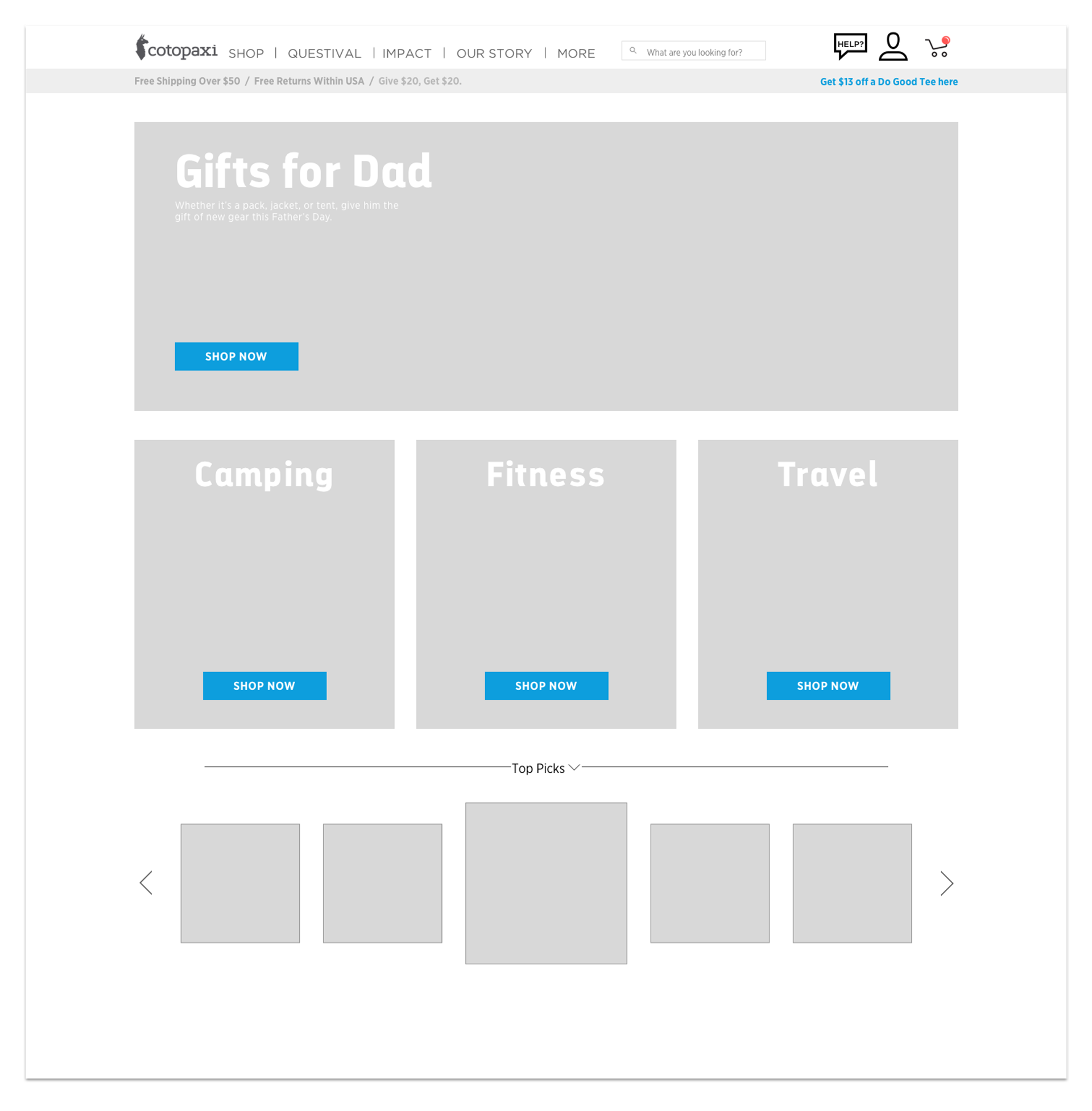
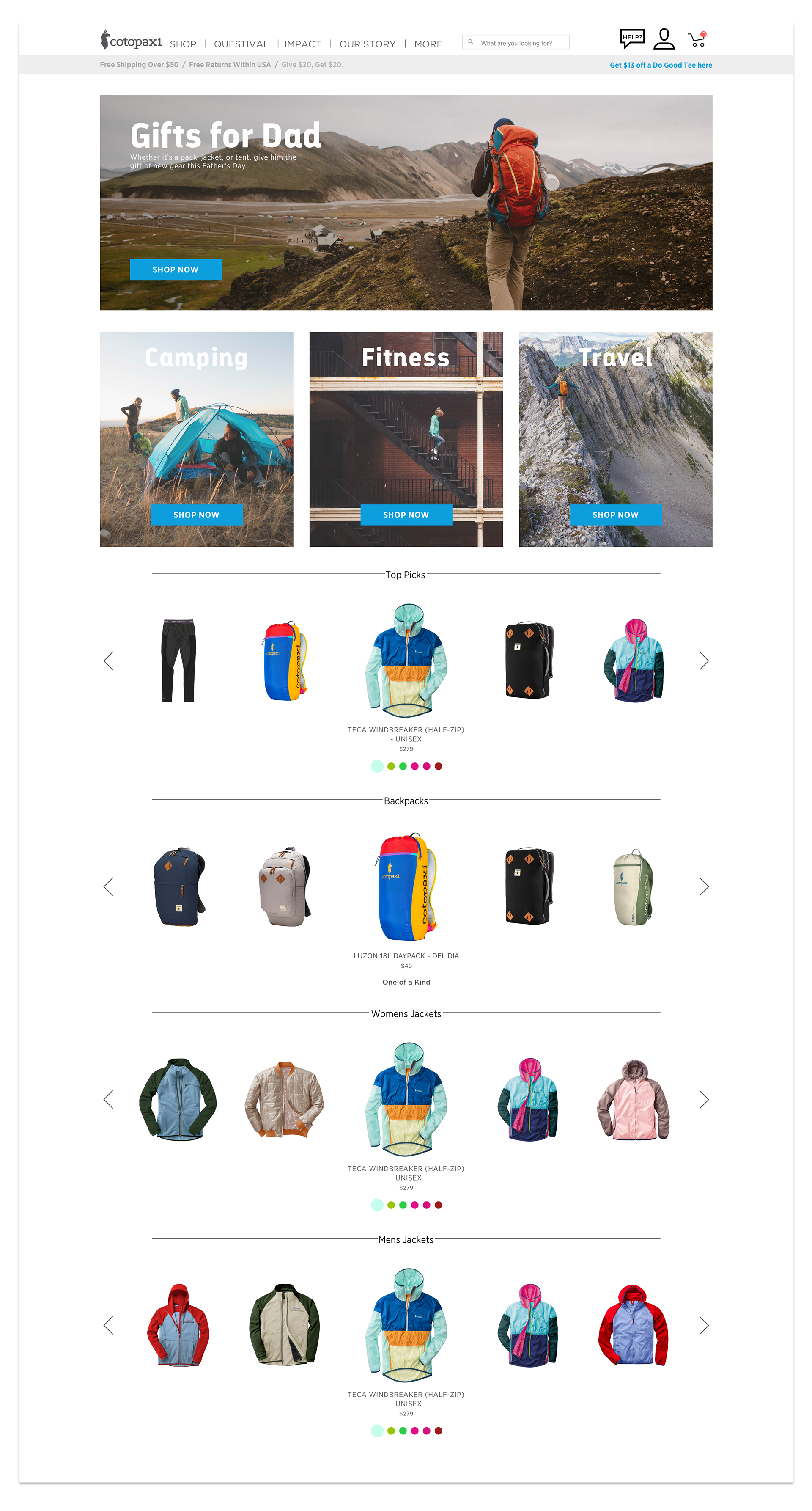
SHOP PAGE DELIVERABLES
I added more color to the deliverables that we presented to Cotopaxi. To break up the carousels of products I added in banners for the companies collections which already have their own landing pages on the website. I also changed the products color swatches to squares instead of circles.

High fidelity shop page prototype shows the use of carousels and a hover state to change colors without having to click in.
CONCLUSION
At the end of the project the team presented our findings to Cotopaxi. We talked about our research and showed them the process it took to get to the deliverables that we had given them. We also advised them to do A/B testing of the site before implementation. The presentation was well received and they were very interested in the research that was done, especially usability tests. We also talked to them about their information architecture and problems with the unisex and Indiegogo links that we found through our card sorting tests.
They said that they were going to talk to their marketing team about getting rid of the unisex option altogether because of how much confusion it caused. They liked the idea of using a static cart on the page and seemed excited about the shop landing page. I'm not sure if they will end up implementing any of our changes but I am glad that I had the opportunity to work with and learn from them. Even if they don't use our work our team succeeded in what we set out to do. We researched the problem and came up with solutions that we tested and iterated on along the way.