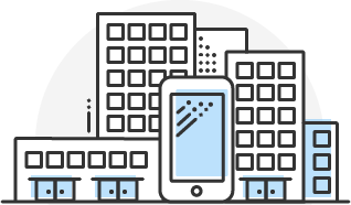
I currently work at MX technologies in Lehi and I LOVE it. It's a great place to solve some interesting problems and make a big impact on people's lives. Right now I work on our mobile product called Helios, which has millions of users. If you want to know more about the product I work on you can check out the details on our website.
Because of confidentiality, I'm not able to post a lot of my work. If you're interested in seeing more of what I've done at MX I'd be happy to come in and share some of my projects with you.
Usability Testing
When I started at MX I was the only designer and took over the responsiblity of user testing. I have done all of the recruiting and usability testing for all of our products over the past year. We've had a lot of great insights and the tests have helped us shape our products to help our users.
Helios Design Audit
while working on the mobile team I have been performing a design audit of our product. Before I started at MX they didn't have a designer which caused the app to acquire a lot of inconsistencies in the design. This has been an ongoing project for me and I have been steadily working towards updating our entire style guide. Here is an example of one of those components and the before and after.
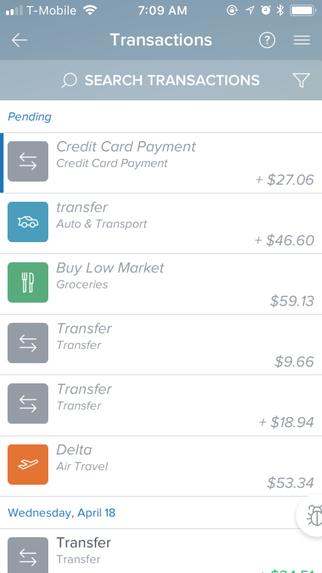
During user testing we noticed some of the users having problems with the top bar in our app. We had what was called an "action bar" that was actionable on a few screens, but was just taking up space everywhere else. We found that we had trained our users to ignore this area of the app and they missed features such as searching and filtering.
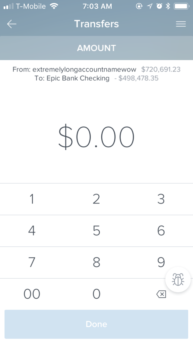
Here is what the top bar looked like before the design audit.
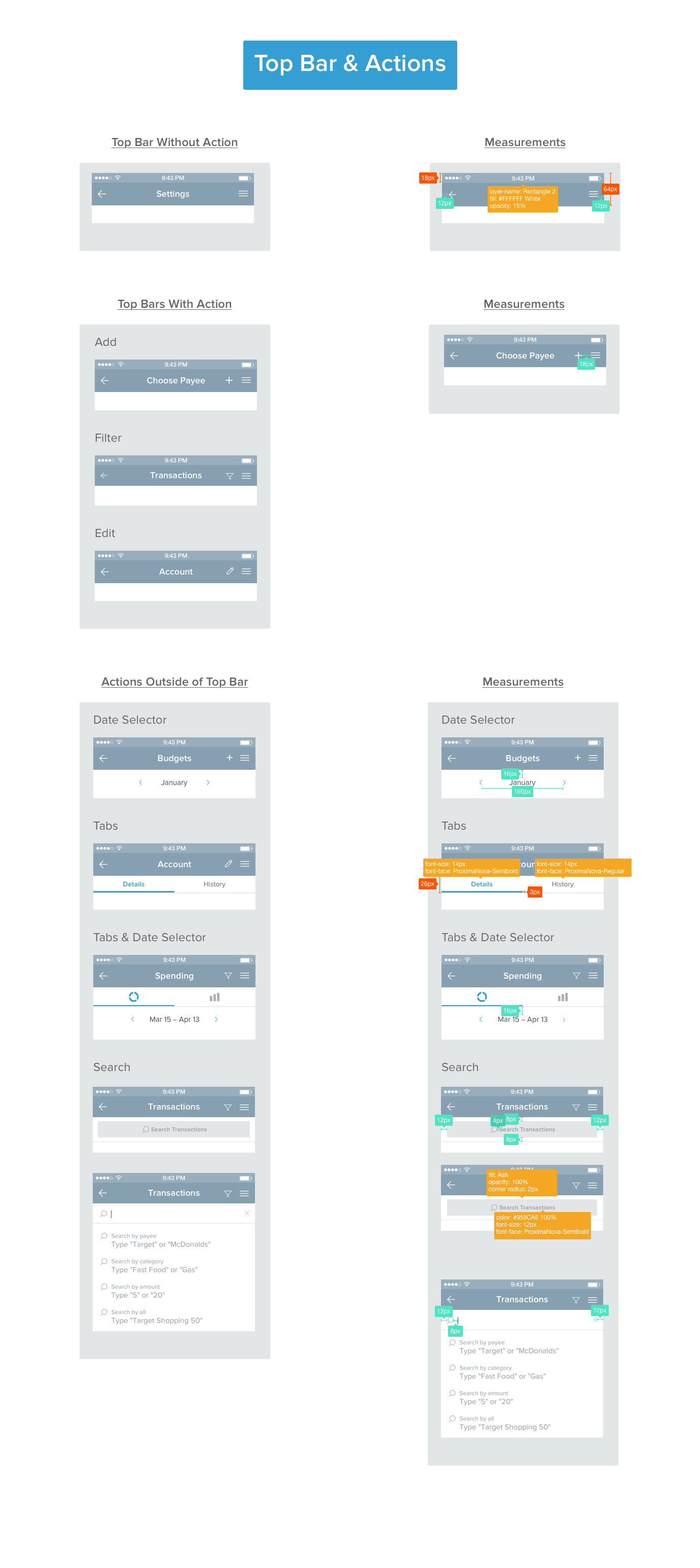
Here is a style guide for our new top bar after the redesign and user testing.
Onboarding Redesign
After some time at MX I noticed that we were constantly having to maintain our user onboarding screens. They were made from actual screenshots of our app so anytime we changed anything I had to create new screens and the developers had to update them for every client. This wasn't a scalable option for our product so I designed new screens that better addressed what our users wanted to see and would not be so time consuming to maintain.
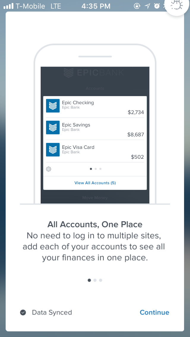
Some of our initial onboarding screens.
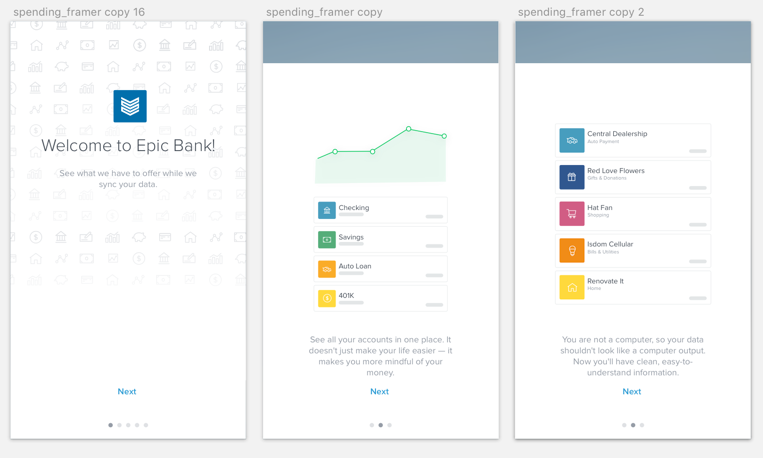
Some of the onboarding screens after our redesign. These screens were also animated using After Effects.
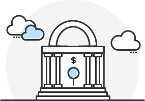
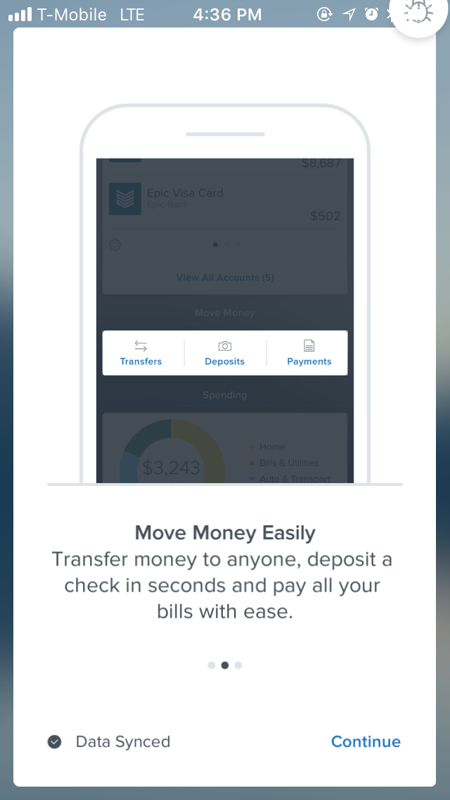
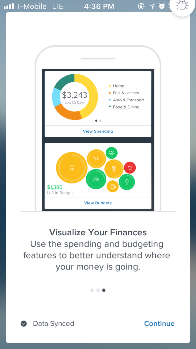
Spending Redesign
During user testing we had a lot of users point out problems with our spending feature. They didn't understand why there was a spending pie for income and why it was always one color. They also wanted another way to view their spending over time. After a lot of iterations and user testing here is the final result in a Framer prototype.
Because of the drastic change to the spending feature I also created new onboarding screens to help users understand how to use the updated feature.
Illustrations
I have done some work on illustrations for onboarding and updating our zero states. Here are some of the illustrations that I have made. I have also helped to make an illustration style guide to keep them consistent across all of our products.